Hello customers! You may not know me, but if you’ve ordered with us before I know your artwork. If you’re just window shopping, hello to you, too! Perhaps I’ll get to see your artwork soon.
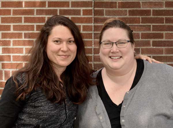
I’m a designer with Grey Fox Pottery; here to share some insights with you on our medallion layout process. I’ll use plenty of images to help you visualize and understand our process and the key factors that help us create beautiful custom logo clay medallions.
Here we go!
First, we convert your logo into black & white vector art. We like vector files (such as Adobe pdf, eps, svg, ai) because they can be resized indefinitely and never lose quality, unlike your typical image file (such as jpg, png, tiff).
Some of you already have the vector files for your logo. In that case, this step goes by much faster. But it’s absolutely fine if you don’t because we can do the conversion for you.
Sometimes these conversions are straight forward.
original submission
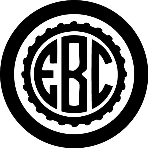
Sometimes they require a bit more thought & creativity.
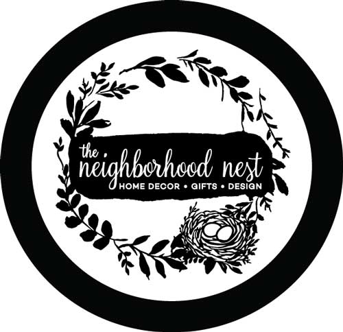


Sometimes they just require more time & energy (and coffee).
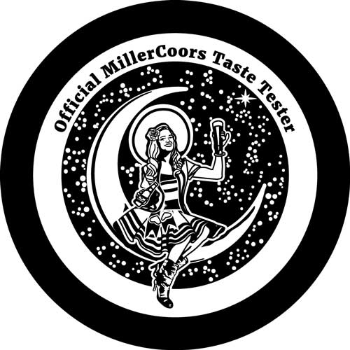
And sometimes they really make us question our career paths, but I’ll keep those to myself!
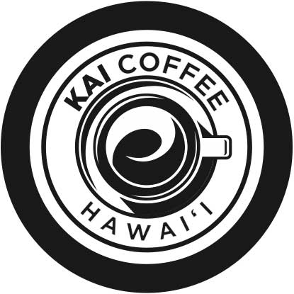
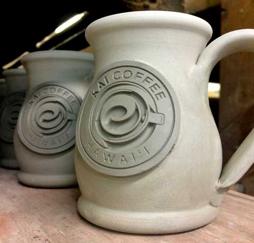
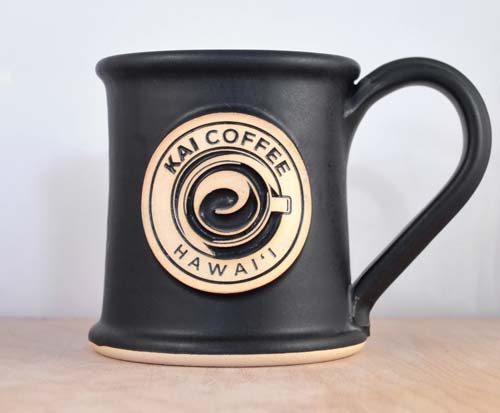
The black in the digital layout represents the glaze-filled recessed areas of the clay medallion, and white represents the raised and unglazed elements. Simple enough.
Now, unless your logo is a rare unicorn, many questions will run through our minds during this conversion process. Is there enough black? Is there too much black? Are the lines bold enough? Is that a good shape for the overall medallion?
The most stunning clay medallions have a healthy balance of black and white, strong and bold lines, and an outer border shaped beautifully to hold it all together.
BALANCE.
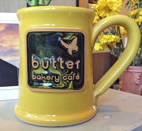
Once upon a time, we did a test run with Butter Bakery Cafe’s extremely black art. When fired, the large amounts of liquid glaze slid down the medallion and over the outer edge.
If we were to add a few white lines to interrupt the large amounts of black, the glaze would have somewhere to rest. It wouldn’t be able to pool together and make its escape in the kiln.
We also try to stay away from medallions that have too much uninterrupted white. If a medallion is too white, and it has to contour around a bulbous mug (such as the potbelly), it could stretch and crack in unseemly ways. It could even pull away from the mug while being fired in the kiln.
Sometimes it’s as simple as adding a border.
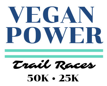
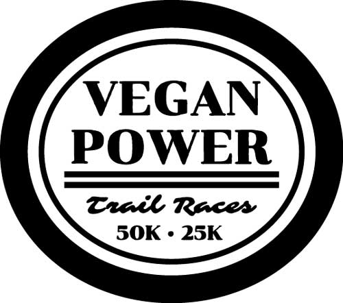
Sometimes we need to add black.
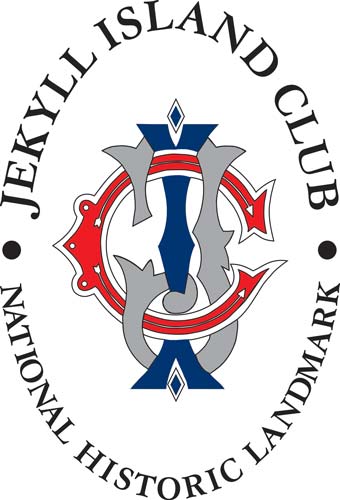
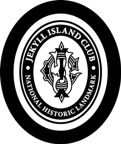
Sometimes we need to add white.
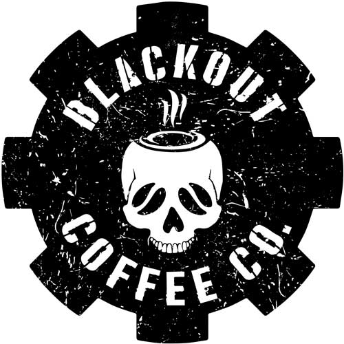
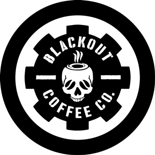
And sometimes we need to inverse the logo colors completely.
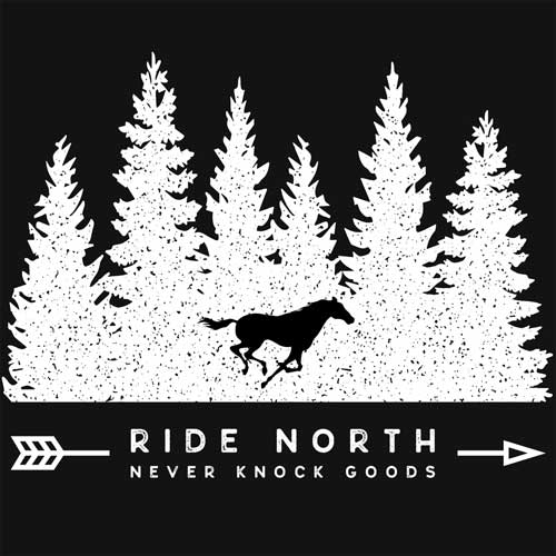
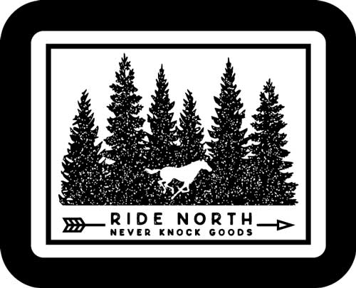
Whether or not your logo is finely detailed or minimalistic, it needs a good balance. It also needs strong lines.
STRONG LINES.
Clay is clay. It’s a forgiving material, but it has its limits. We work with the clay to make sure all the elements will hold strong. Your logo is pressed into a clay medallion, which is then filled with glaze, sanded clean and fired in the kiln. It needs to stand up to all of these rough journeys.
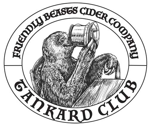
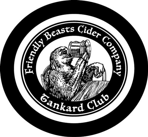
So if your logo is similar to Friendly Beasts Cider Company – with extremely fine details – we may need to do some revisions or redrawing. Remember our previous problem of having too much uninterrupted, black? Well, we also don’t want too much interruption.
The glaze needs somewhere to rest, but it also needs enough space to sit. Otherwise, it could be so faint, the details become muddled.
SHAPE.
What is the shape of your logo? Is it short and wide? Tall and skinny? Perfectly round?
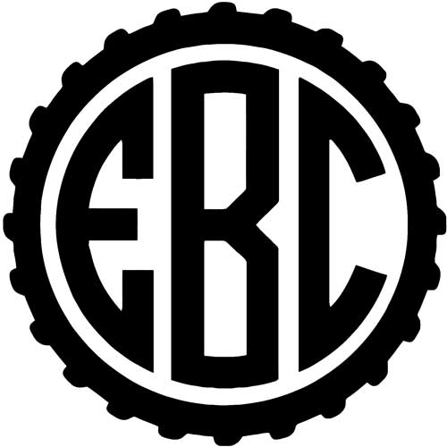
In many cases, your logo’s shape determines medallion shape. Obviously, right? Well in many cases, yes. Take a look at Elizabeth Brewing Company’s logo; already contained in a circle.


We didn’t have to put much thought into the shape of this medallion. Go circles!
If your logo is perfectly round or very near, then you’ve made our jobs easier! We’ll place your logo into a circle or an oval if it’s possible because they are the most forgiving shapes for the variety of pottery mug styles we have.
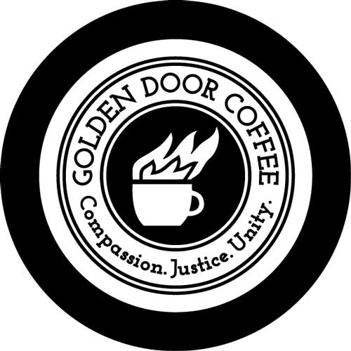
Circles and ovals are also the most efficient shapes for our production artists. They apply your medallions, smooth the edges, apply the glaze fill and clean off excess glaze – all by hand!
In other cases, it can require a bit more thought and creativity. Bell Sheep has a logo that is wide and short. They asked that we add the text, “North Shore,” somewhere in the logo.
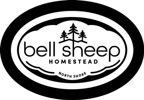
Placing the text under the logo added height. It also nicely balanced out the tree illustration on top. But what shape will this logo look best in? We went with a horizontal oval, but we also added a playful, sheepish outline to add interest and give the glaze more places to hang out.
What do you think? Pretty cute, right?
So why do we even want to add height to a vertically challenged logo? Well, because it looks better on pottery mugs! Not a very scientific answer; I know.
If your logo is short & wide, like Black Sheep’s logo, we usually try to add a bit of height or cut a bit of width where possible. In the same regard, if your logo is tall & narrow, we usually try to add a bit of width or cut a bit of height where possible.
But, what if your logo has hard edges? Squares, triangles, trapezoids, octagons, parallelograms, rhombuses. We’re not saying we dislike edges. We’re not saying that at all!
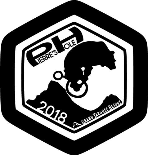
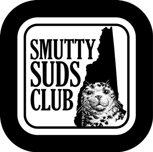
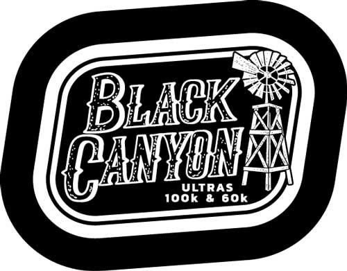
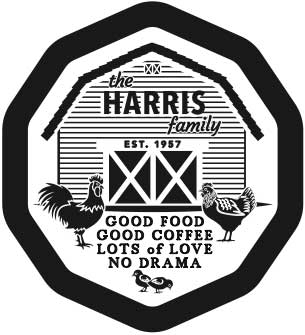
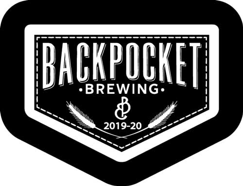
If your logo has edges, the most we’ll do is round out the corners so our production artists can get into all the nooks and crannies with their tools. So, it’s all good if your logo has edges.
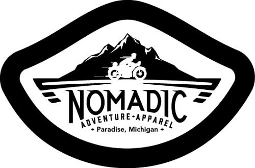
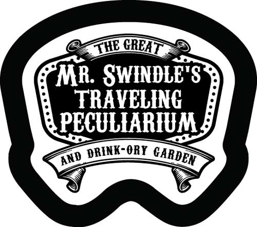
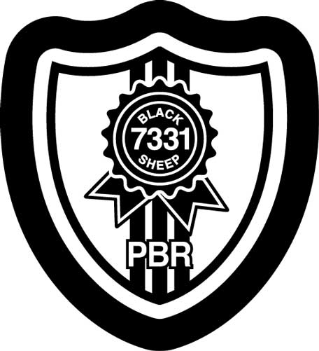
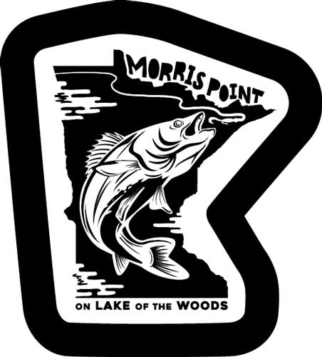
For the most part, we won’t merely jam your logo into a basic shape and call it good. If your logo has a natural edge to it that isn’t too wacky, we’ll follow it. Check these guys out!

Existing customers, if you love the way your clay medallion looks, we are so happy! If you read this and now you’re thinking, “I’d like to update my medallion by adding more black or more white,” give us a call or send us an email! Us designers will take a good hard look at your clay medallion and work on how we can make it look its best.
If you’re a potential customer, not sure if they want to order yet, don’t want to get a hundred emails just because you asked for one quote… really, ask us for a quote. You’ll get an automated email with some info, and Jack will reach out to you to see if you’re still interested after learning more about pricing and lead times. If you say no, that will be the end. No strings attached.
