Beer is the most essential part of your brewery. But it’s not quite as simple as: make good beer, and the people will come. Branding and marketing are important too and, before you can market your brewery and your beer, you need to design a logo. The absolute best brewery logos have that certain something. You can identify a good brewery logo with a glance, whether on a beer stein, a growler, or a t-shirt.
Consider some of the classic examples of timeless brewery and beer logos. Miller High Life, brewed since 1903, is the oldest beer in Miller Brewing’s portfolio. Whether you like the beer or not, you can probably see the logo in your head. With or without the classic “girl on the moon” embellishment, the simple, stylized badge stating Miller High Life immediately tells you you’re looking at “the champagne of beers.”
Possibly the most widely recognizable and universally beloved brewery logo is that of Ireland’s Guinness. The logo consists of the word Guinness and, of course, the harp representing Ireland. The Guinness logo has worked for more than 150 years because of its simple lines, meaningful symbolism, and the fact that it looks great on merchandise, advertising, and beer packaging worldwide.
Keep reading for some of our favorites of the last few years. Many of these breweries are just getting started compared to Miller High Life or Guinness, but their beer and their logos may well stand the test of time.
Revelation Ale Works
If you’re heading to northern Minnesota, be sure to visit Revelation Ale Works in Hallock. You’ll know you’re there when you come upon the remodeled Standard Station that is their taproom. Their logo, a simple lightbulb with their name inside, is smart and distinctive, and looks great on the building, on a hat, and on growlers. This clever logo reflects the idea or revelation—the “lightbulb”—they had to start their ultra-rural brewery in a town of barely 900 people.
Modist
Located in the North Loop neighborhood of Minneapolis, Modist has a great taproom and good beer, and their logo exhibits that good quality atmosphere. They use an architectural M and their name in their logo, making it simple but dynamic. This bold simplicity allows them to go a little wild with the packaging on their cans. The Indacouch aesthetic might remind you of a grandmother’s 70s furniture, and the clean logo manages to stand out and accentuate the trippy can.

Loose Ends Brewing Company
If you’re in Centerville, Ohio, stop in for a pint and dinner at Loose Ends Brewing Company. You may find yourself drawn in by their attractive logo. The next thing you know you’re buying a hoodie or t-shirt, and no one would blame you. Loose Ends logo is a simple geometric line drawing in a circular badge. It’s hard to say why one logo works and another misses the mark, but this logo is great on the taps, on a beer stein, and on general merchandise.
The Nordic Brewing Company
Located in Monticello, Minnesota, The Nordic Brewing Company takes the adage that less is more and says, “Nah!” Their logo is not simple; it is strikingly intricate but not too busy. A wavy line drawing representing the spirit animal of the brewery, their logo is full of motion. However, rendered in one color, it is simple enough to look great on their merchandise and easily identifiable as theirs.
Fulton
In Minnesota’s hyperactive craft brewing marketplace, Fulton has practically become an elder statesman since starting to brew beer in 2009. Their hop star and badge logo has become a classic too, gracing many t-shirts and hats you may have seen around the Twin Cities. Perhaps the Fulton logo works so well because it is simple and stylish. It incorporates hops, which are the foundation of the brewery movement. You can see the logo out of the corner of your eye and know what you’re looking at.
G34.3 Brewing Company

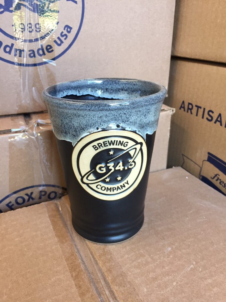
Should you find yourself road tripping through Northern Virginia, be sure to visit G34.3 Brewing Company, and please pick us up a hat because their logo is everything a beer logo should be. It’s pleasing to the eye and tells you a little bit about the unusual name before you even have to ask. According to their website, “G34.3” gets its name from the largest deep space cosmic cloud of ethanol yet discovered. The cloud contains enough ethanol to supply 300,000 pints of beer to every person on earth, every single day for the next billion years. I don’t know about you, but we’d love to chat with the owners over one of their pints. “Do they have a mug club?” you might ask. Well, sort of. It’s called,“The Space Force,” and we wish we could join.
Your Brewery, Your Logo
Choosing your logo isn’t quite as crucial as your beer, but it is the visual representation of your brand. You want it to be just right. Consider how you’ll use your logo and picture in on your signage, packaging, and merchandise. Use your logo to tie everything together in your brewery – on your beer mugs, your signage, and your merchandise.
Consider quality stoneware beer steins for taproom patrons, mug clubs, or for special occasions. Take a look at some examples of Grey Fox Pottery’s quality hand-crafted stoneware steins and picture one with your brewery logo. Talk to us today about getting your logo badge just right, whether your logo is simple, bold lines, or an intricate design.
